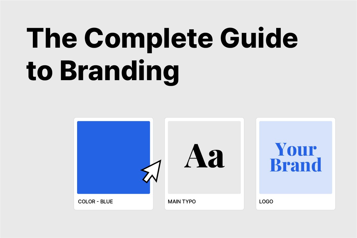
Minimalist Logos & the Power of Simplicity
May 11, 2025
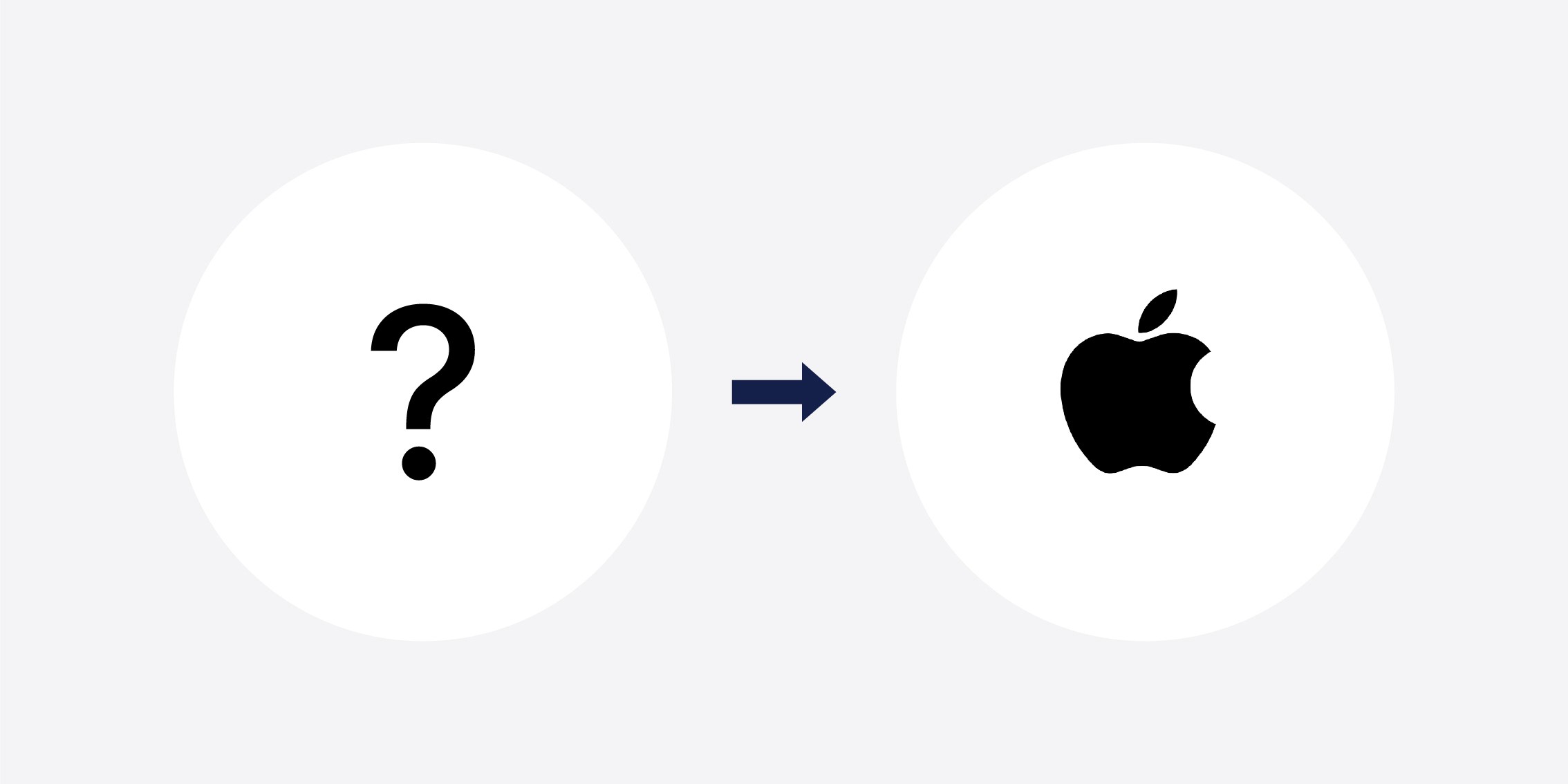
What comes to mind when you see Apple’s logo? You might think, “It’s just an apple,” right? But, behind that simple fruit lies a brand worth tens of billions of dollars! These days, the world’s biggest brands are all simplifying their logos.
Just as Nike’s $35 swoosh logo became a $30 million brand asset, your small business can apply minimalist logo strategies!
What may seem like just an aesthetic trend is actually backed by scientific research. This study demonstrates that a minimalist logo redesign is linked with statistically significant increases in both brand recognition and brand perception. This isn’t just a coincidence. It’s based on psychological insights into how the human brain processes information.
Market Insight: Simplicity = Power
Let’s look at the numbers: A majority of the world’s most recognizable brands (about 95%) have minimalist logos.
Companies that redesigned their logos with a minimalist approach saw:
11% revenue growth in the first year (up to 33% in some cases)
15% increase in brand recognition within 6 months
3.2x higher return on investment (ROI) from simple design initiatives
What does this tell us?
Simplicity is powerful.
Seven Surprising Facts about Minimalist Logos
1) The $35 Miracle That Became Worth $30 Million: Nike’s Swoosh
In 1971, Carolyn Davidson, a graphic design student at Portland State University, was struggling to afford oil paints. Her accounting professor, Phil Knight (co-founder of Nike), offered her a freelance gig at $2 an hour.
She worked for 17.5 hours and was paid $35 for creating what is now the most iconic sports brand logo in the world.
Knight’s first reaction was, “I don’t love it... but I think it’ll grow on me.”
In 1983, Nike gifted Davidson a diamond Swoosh ring and 500 shares of Nike stock, now worth over $30 million, as thanks.
2) Apple’s $100,000 Investment vs. Newton’s Complicated Logo
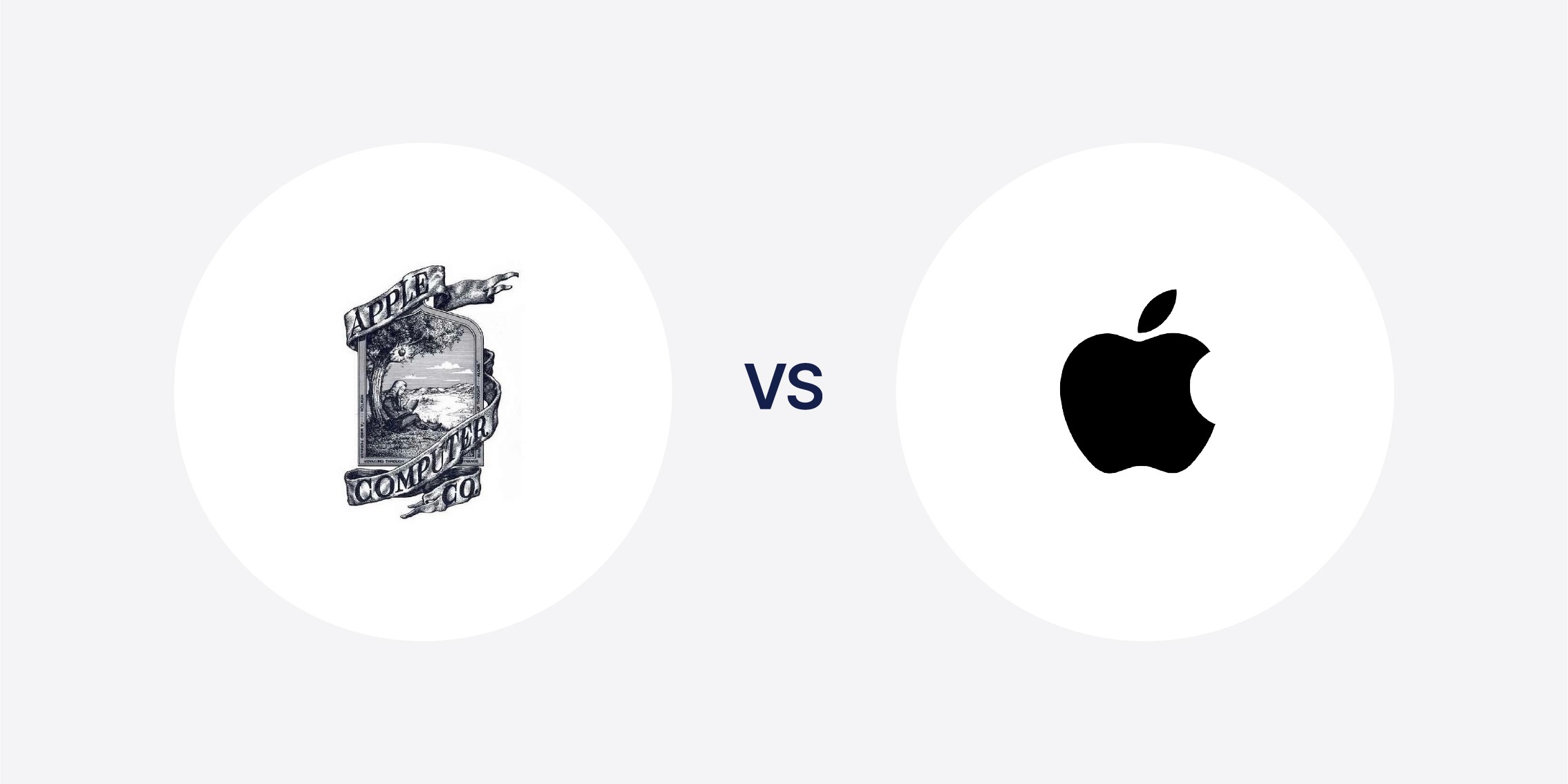
Apple’s original logo was an overly detailed image of Isaac Newton sitting under an apple tree.
Steve Jobs scrapped it within a year and paid designer Rob Janoff $100,000 to create a cleaner design.
Why the bite in the apple? “So people wouldn’t mistake it for a cherry.”
In 1998, Jobs updated to a monochrome version of the logo. Today, the minimalist Apple logo is one of the most universally recognized logos on the planet.
3) The Starbucks Siren’s Hidden Story
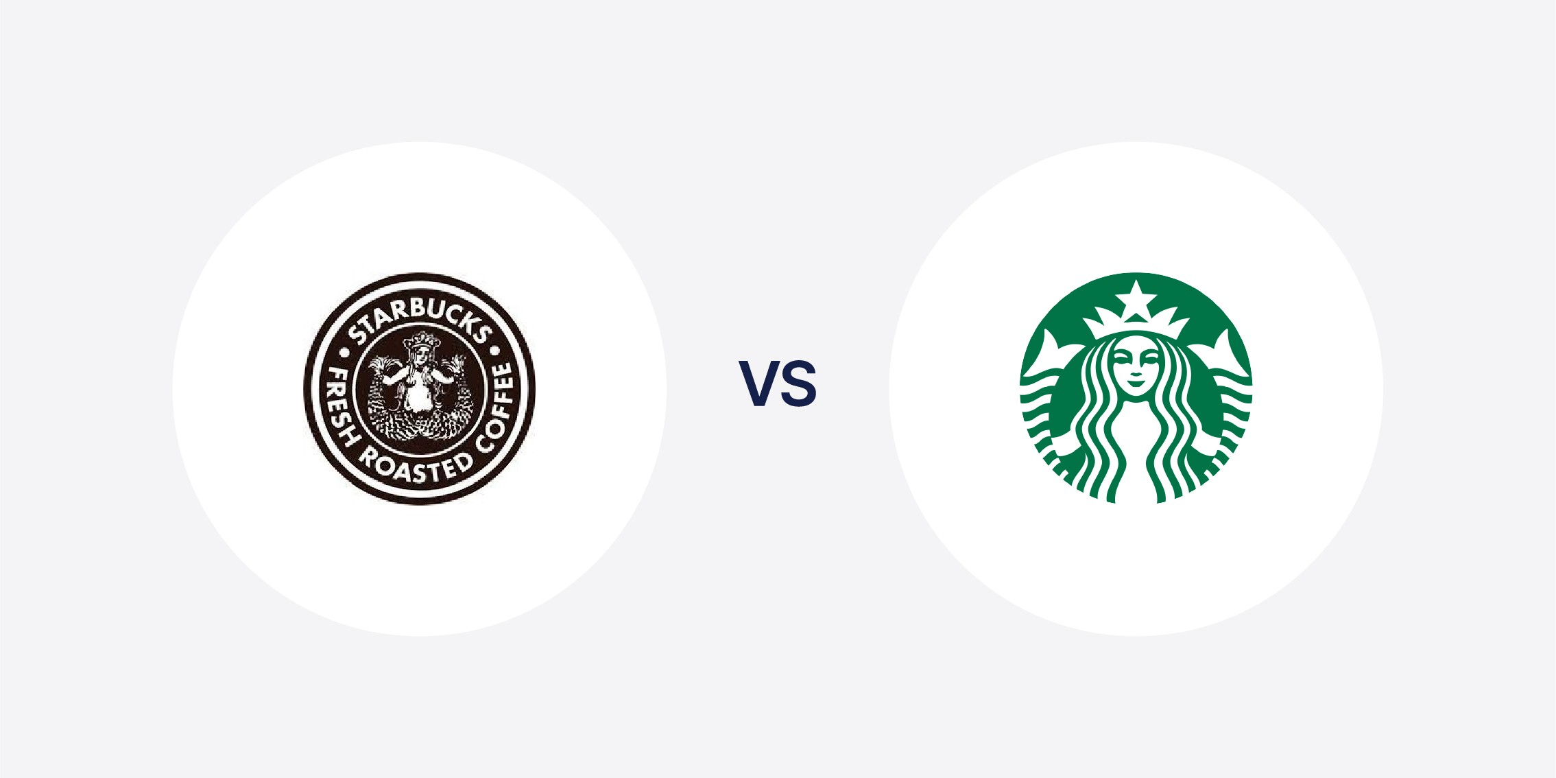
Did you know the Starbucks logo isn’t a mermaid? It’s a two-tailed siren.
The original 1971 version showed a fully exposed siren, but over time, the design was simplified. In 2011, the text was completely removed, leaving just the siren.
The original designers purposefully made the siren’s face asymmetrical, but when the logo was later redesigned, she was made to be symmetrical to better match a minimalist aesthetic. This logo performed so much better than the original, non-minimalist design then when Starbucks tried to bring back its original logo to celebrate its 40th anniversary, customers were outraged and demanded the return of the minimalist siren.
4) Mastercard’s 50-Year Plan
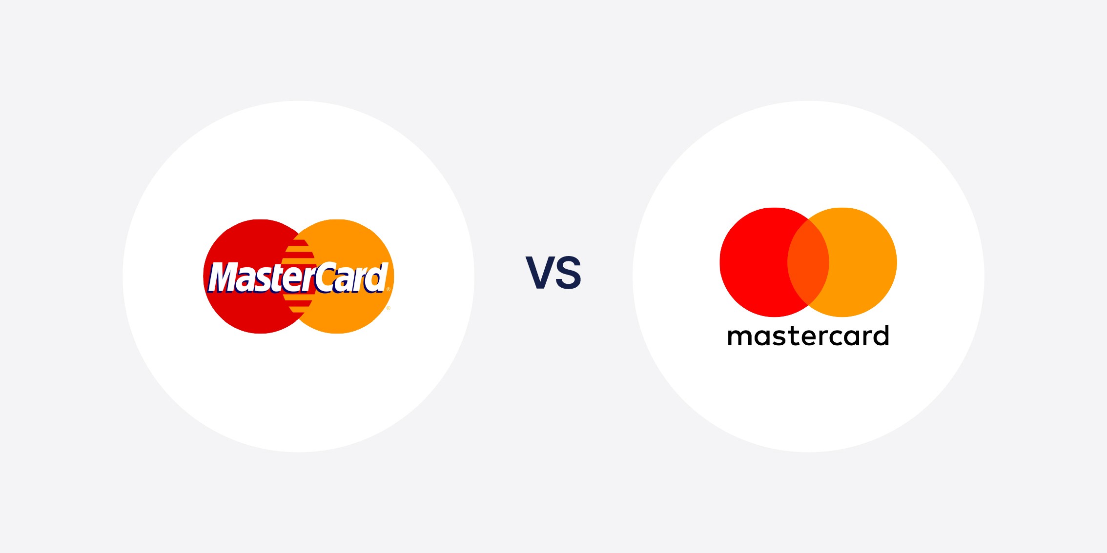
Mastercard has used the overlapping red and yellow circles since 1966. In 2019, after research showed that 80% of people recognized the brand just from colors and shapes, they removed the text altogether. Now, like Apple, Nike, and Mercedes-Benz, Mastercard is part of the elite group of symbol-only brands. Their 50-year effort finally paid off.
5) Instagram’s Rebrand Drama: From Widely Hated to Icon Status
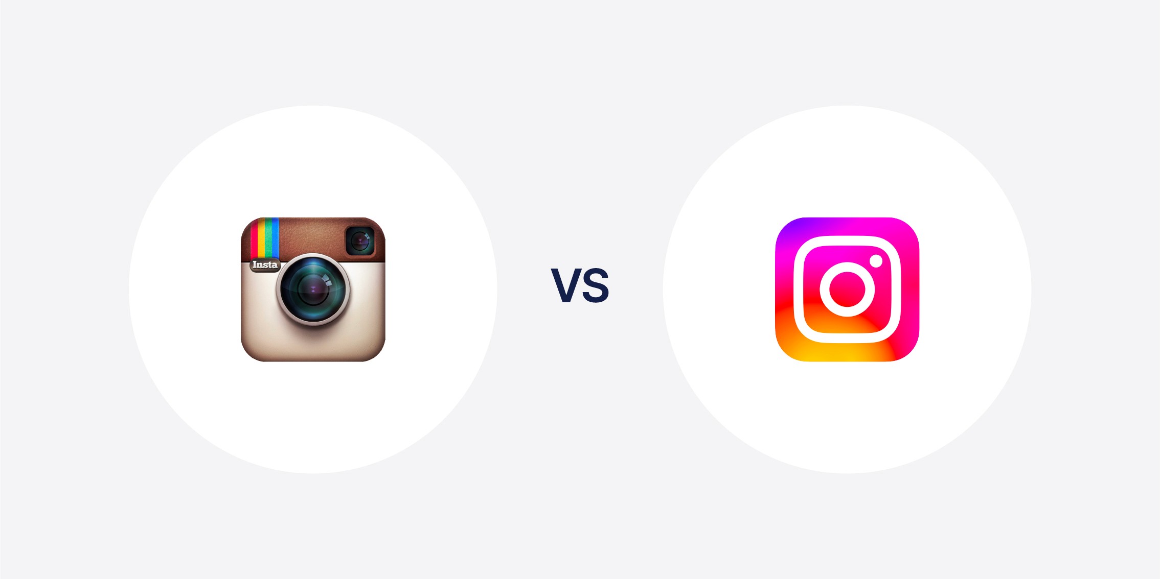
When Instagram first switched to a flat, minimalist design in 2016, 70% of users hated it. Critics said it looked like “rejected Starburst candy” and some businesses refused to use it on their websites. However, the design team persisted. They went through 300 iterations over 9 months. Eventually, public perception of the app’s logo changed. Today, it’s one of the most recognized app icons in the world. So, what’s the takeaway from this? Sometimes, short-term backlash is worth it for long-term gain, especially when it comes to logo redesigns.
6) Neuroscience Confirms the Power of Simplicity
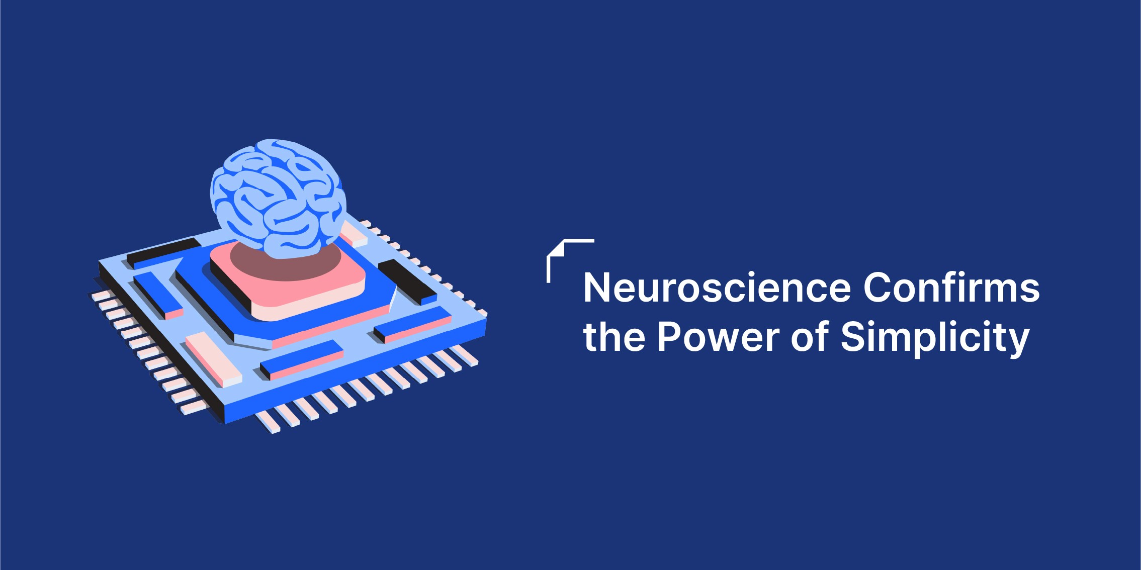
Scientific research has shown that the brain processes visuals 60,000 times faster than text. This is due to Processing Fluency. Simple visuals are easier and quicker to understand.
As a result, simple logos…
…are recognized 120 milliseconds faster than complex ones.
…have 30% higher memory retention after 24 hours.
…have 80% recognition accuracy after just one exposure.
7) Luxury Branding & the Psychology of Simplicity
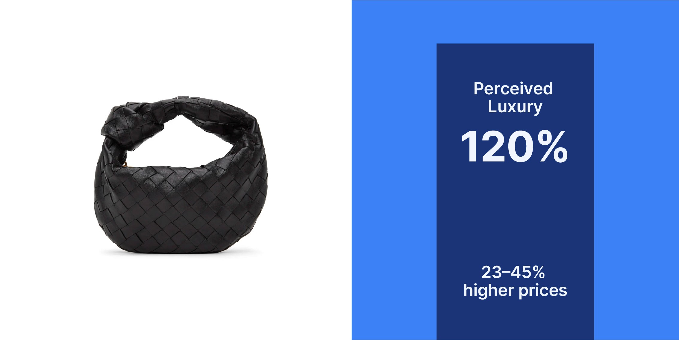
A study on the “Quiet Luxury” trend showed that simplified logos increased perceived luxury by 120%. Clean, understated designs are naturally associated with quality, high-end products. There’s a demonstrable impact on pricing, as well. Minimalist designs can justify 23–45% higher prices compared to complex alternatives.
Fun Fact!
Have you noticed the hidden arrow between the E and the X in the FedEx logo?
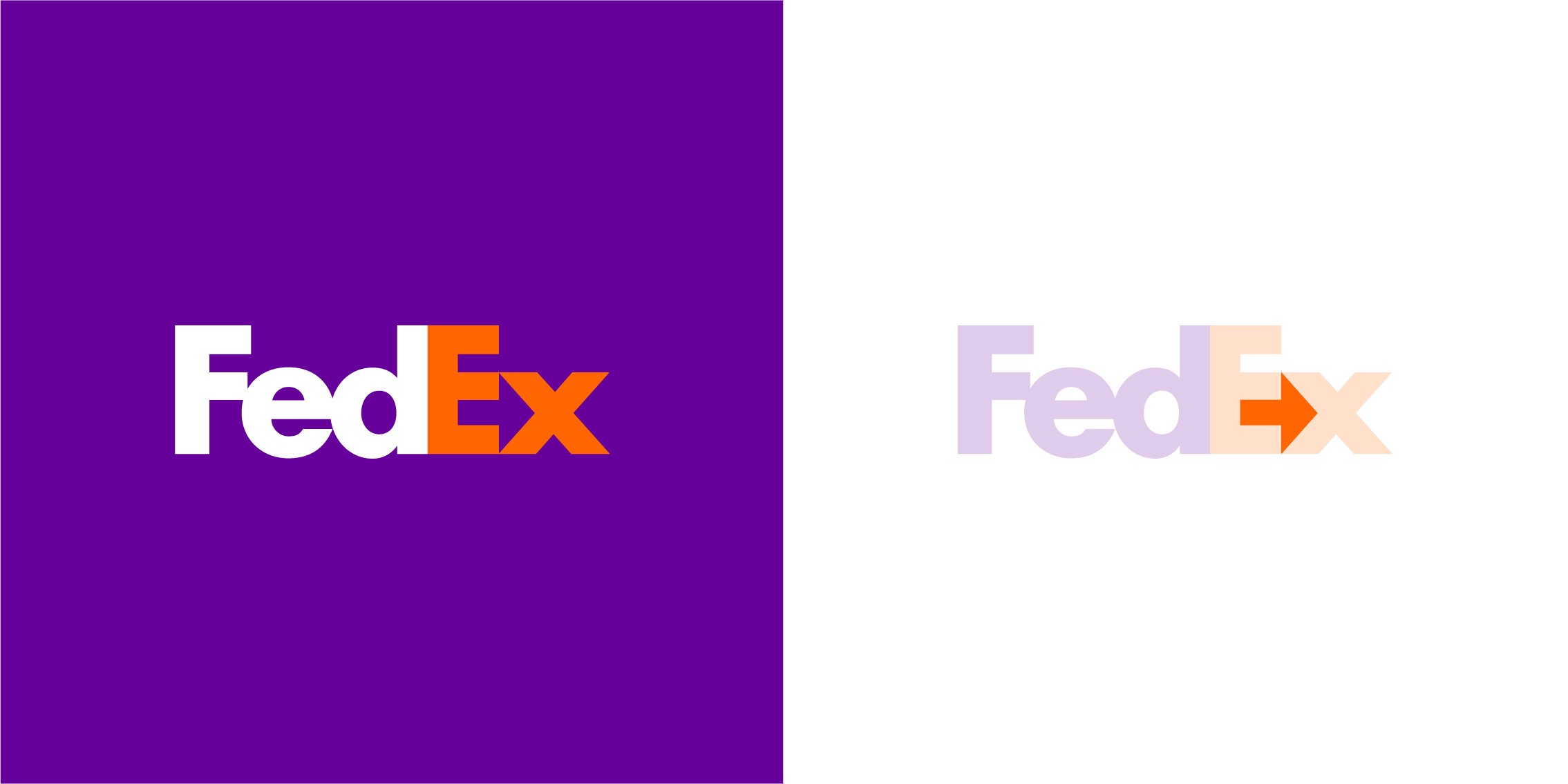
That’s called the “Principle of Closure”. Our brains instinctively fill in missing visual information. Logos using this principle have 40% higher rates of brand recall!
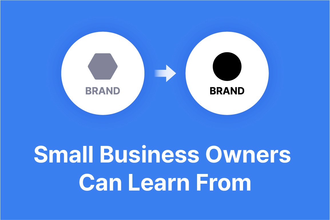
How Small Business Owners Can Apply These Lessons
Step 1: Assess Your Current Logo
Is it clear at small image sizes (e.g., social media avatars)?
Does it still work in black and white?
Is it distinct from your competitors?
Step 2: Gradually Simplify
Remove decorative elements
Limit your logo to 2-3 colors
Keep your unique differentiators intact
Step 3: Test Out Your New Logo
Get feedback from friends/customers
Run A/B tests on social media (this can cost between $50-$200)
Use free tools like SurveyMonkey to solicit feedback
Budget-Friendly Approaches
Under $300
Use AI tools like Canva and Looka to redesign your logo
Pros: Quick, easy
Cons: Less originality
$300–$1.5K
Hire a freelance designer
Pros: Custom design
Cons: Quality may vary
$1.5K+
Work with a small design studio
Pros: Strategic branding, cohesive design system
Cons: Higher upfront cost
For more tips on using AI tools for logo design, click here.
Industry-Specific Tips
Food and Beverage: Keep appetite-stimulating colors like red and orange in your logo
B2B Services: Focus on communicating reliability and professionalism
Retail: Prioritize visibility at point of sale
Tech Startups: Use futuristic, innovative visuals to stand out
Want Help? Try Tidy-B for Minimalist Branding
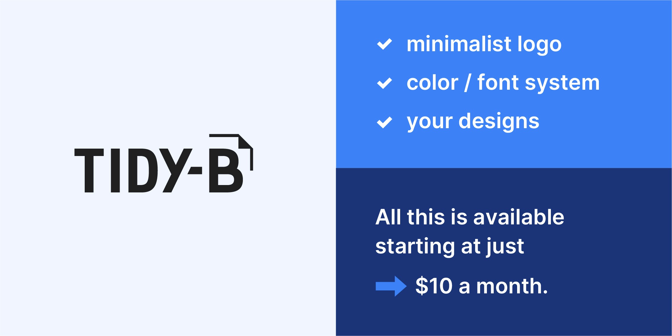
Want to bring minimalist branding to your business, just like major companies?
Tidy-B is the all-in-one AI branding platform that helps you:
Create your unique minimalist logo
Build a consistent color and font system
Apply your designs across business cards, social media, and marketing materials
Store everything in the cloud
All this is available starting at just $10 a month.
Coming in at just $0.33 per day, that’s way cheaper than your daily latte, and guarantees you’ll have world-class branding for your business!
Final Thoughts & Call to Action
The true secret of minimalist logos is that there is depth within simplicity. Nike’s $35 swoosh became worth $30 million not because it was simple, but because it captured the brand’s core message in the most efficient way possible.
For small business owners, minimalism is not just a trend. It’s an opportunity. You don’t need a huge budget to build a strong brand. What matters most is finding your core message, communicating it clearly, and doing so with consistency and purpose.
What logos have impressed you the most? Thinking about simplifying your own?
Let us know in the comments! What parts of rebranding are you most unsure about?